Project: Payroll Solution Campaign Assets
Part 1: Campaign Asset Design
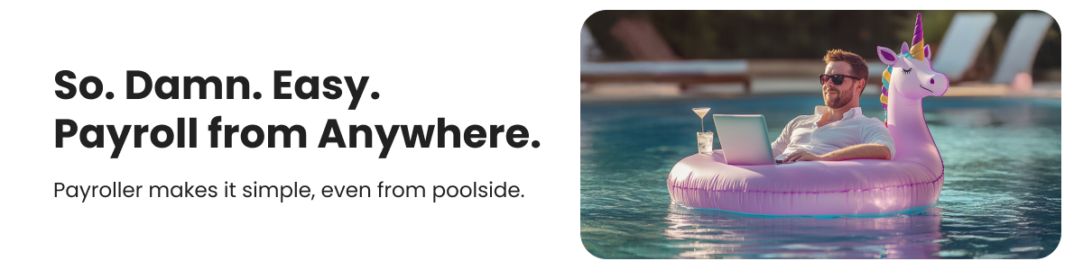
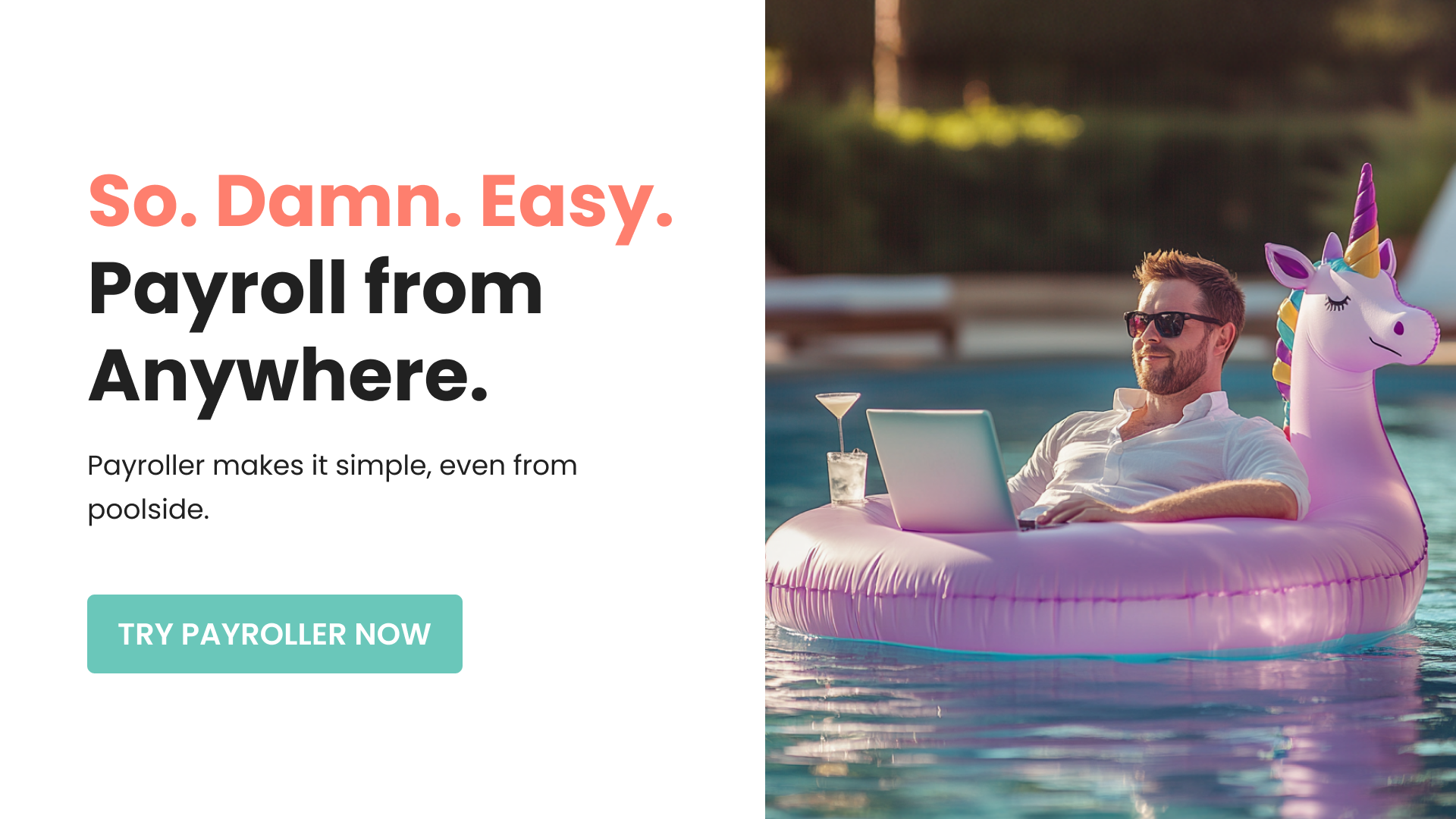
Brief: Design a visually impactful and compelling ad asset for Payroller to promote its payroll management solution for small business owners.
Brief: Design a visually impactful and compelling ad asset for Payroller to promote its payroll management solution for small business owners.
Post Copy:
Hook Line: So. Damn. Easy. Payroll done in minutes.
Subheadline: Your business, your way.
Body Copy: Small business owner? Don’t let payroll slow you down. With Payroller, you can run your payroll effortlessly, leaving you more time to focus on what really matters – growing your business.
Call-to-Action (CTA): Start Your Free Trial Today!
Purpose and Goal:
The purpose was to create a professional, user-centric campaign asset that resonates with small business owners' challenges while highlighting the simplicity and time-saving benefits of Payroller. The design prioritized readability and quick information retention, encouraging immediate action through a strong CTA.
The purpose was to create a professional, user-centric campaign asset that resonates with small business owners' challenges while highlighting the simplicity and time-saving benefits of Payroller. The design prioritized readability and quick information retention, encouraging immediate action through a strong CTA.


Project: Payroll Solution Campaign Assets
Part 2: Social Media Post Design
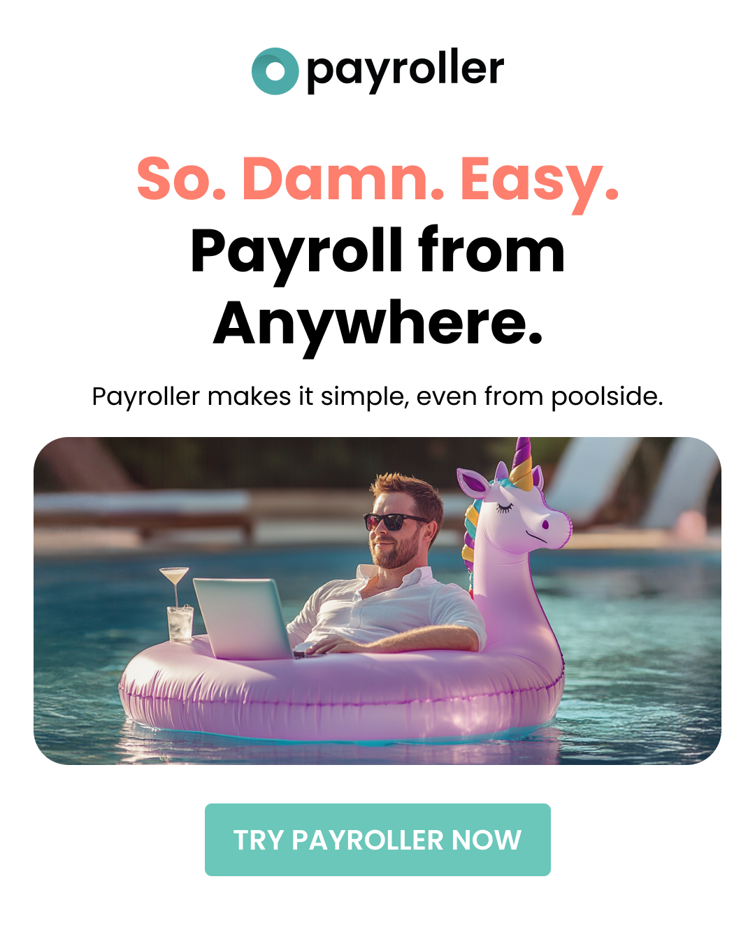
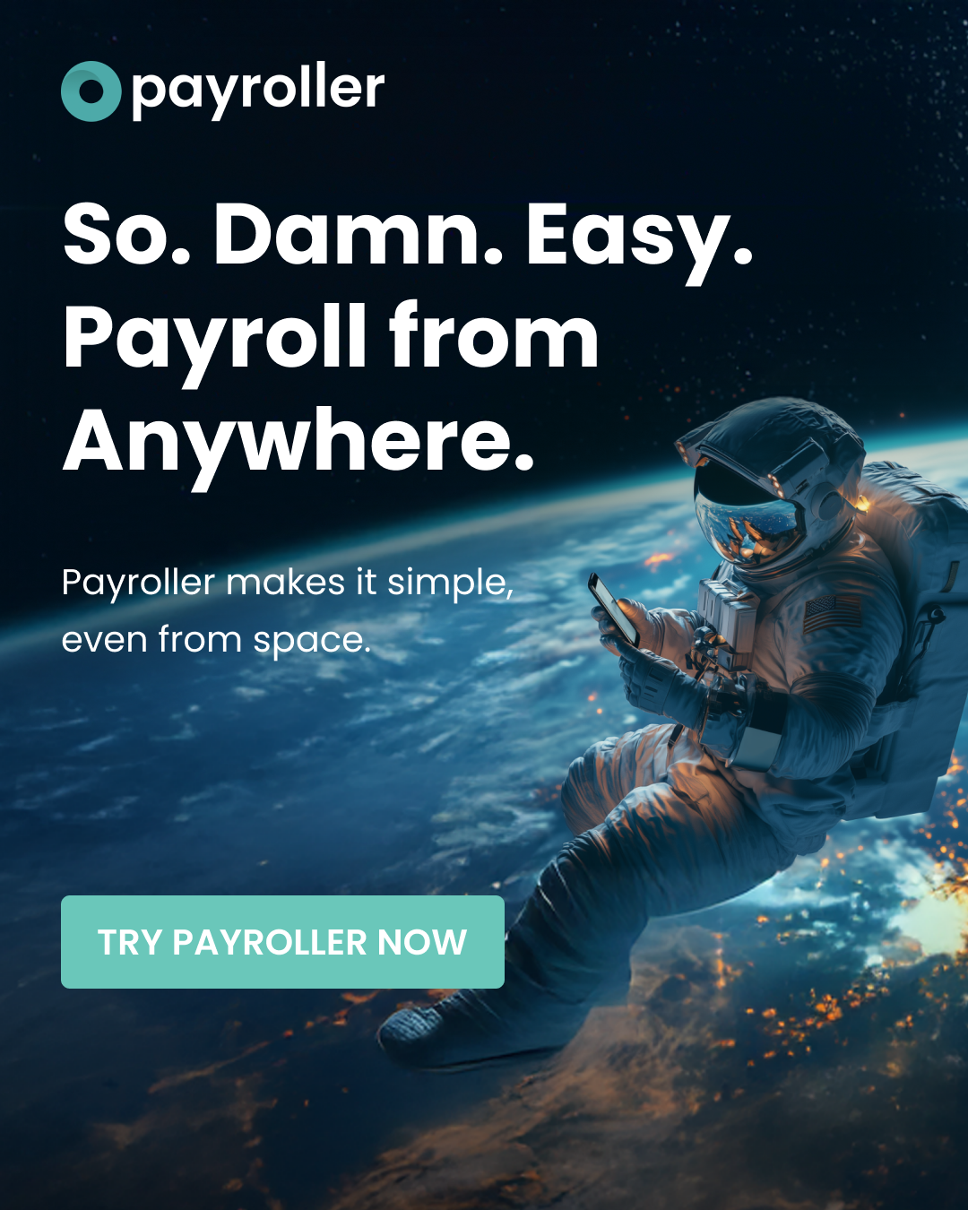
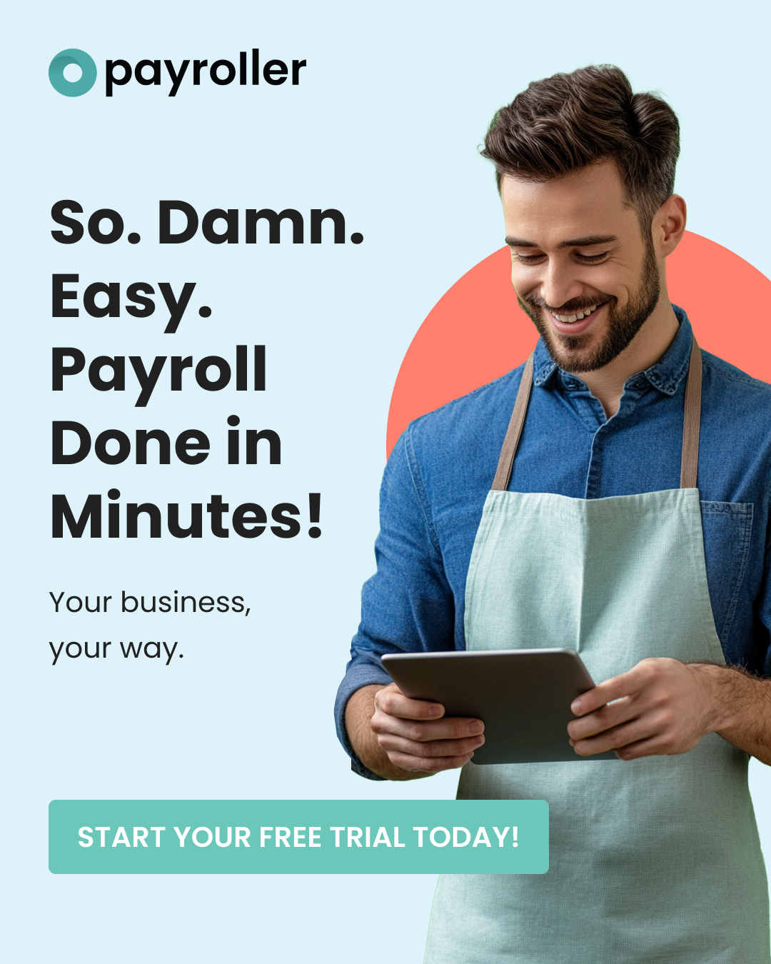
Brief: Develop a social media post to amplify Payroller’s message, targeting small business owners across digital platforms.
Post Copy:
Hook Line: So. Damn. Easy. Payroll done in minutes.
Subheadline: Your business, your way.
Body Copy: Small business owner? Don’t let payroll slow you down. With Payroller, you can run your payroll effortlessly, leaving you more time to focus on what really matters – growing your business.
Call-to-Action (CTA): Start Your Free Trial Today!
Purpose and Goal:
The goal was to create an engaging and scroll-stopping design tailored for social media platforms. The post highlights the ease of use and efficiency of Payroller, supported by concise copy and a compelling hook to drive clicks and conversions.
The goal was to create an engaging and scroll-stopping design tailored for social media platforms. The post highlights the ease of use and efficiency of Payroller, supported by concise copy and a compelling hook to drive clicks and conversions.

Ads & Campaign Design Portfolio: Case Study
Project: Competitive Insights Campaign
Brief:
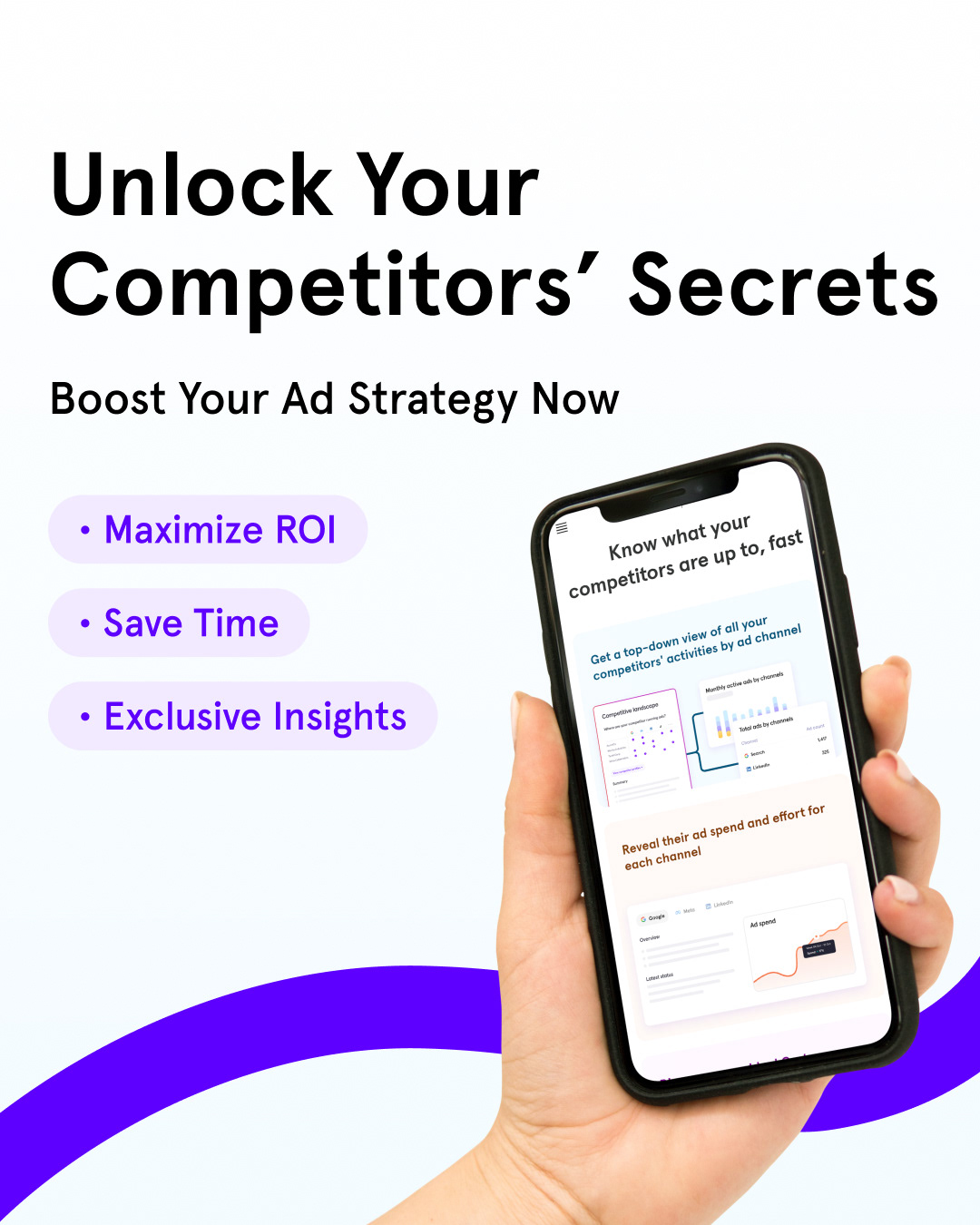
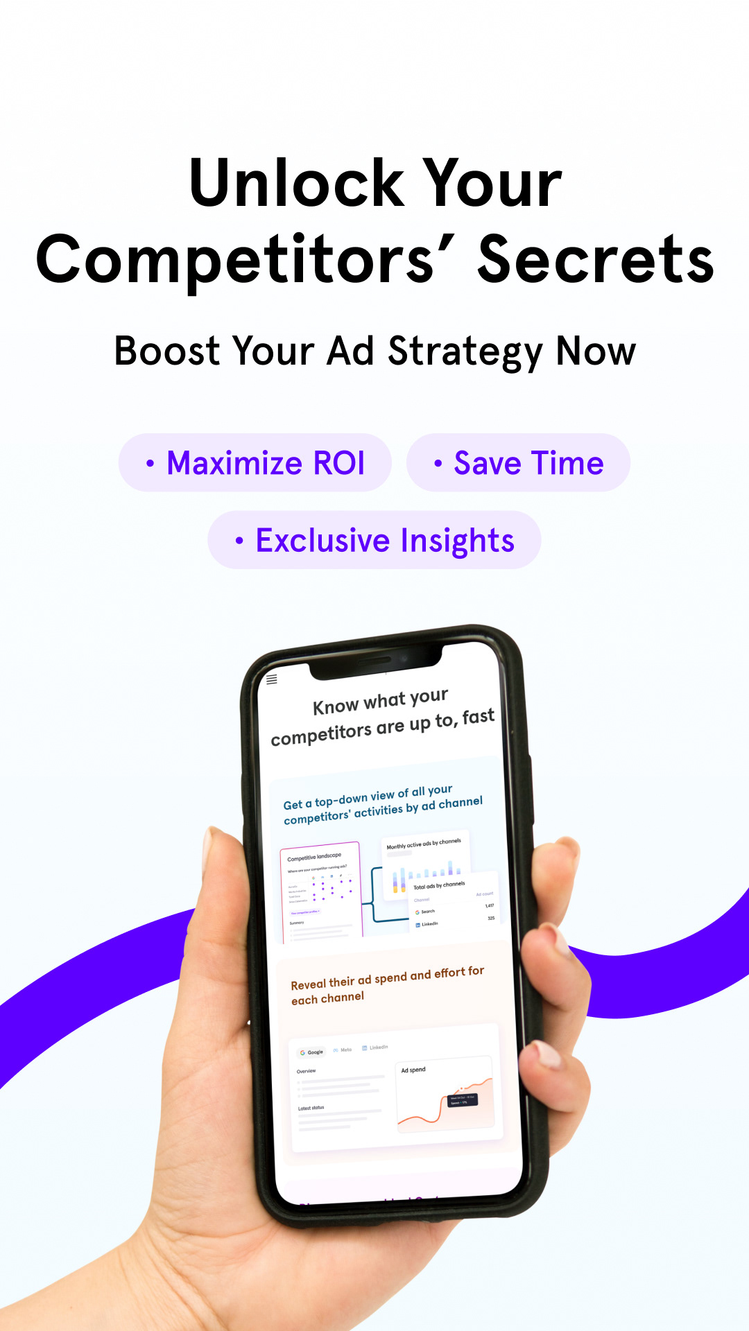
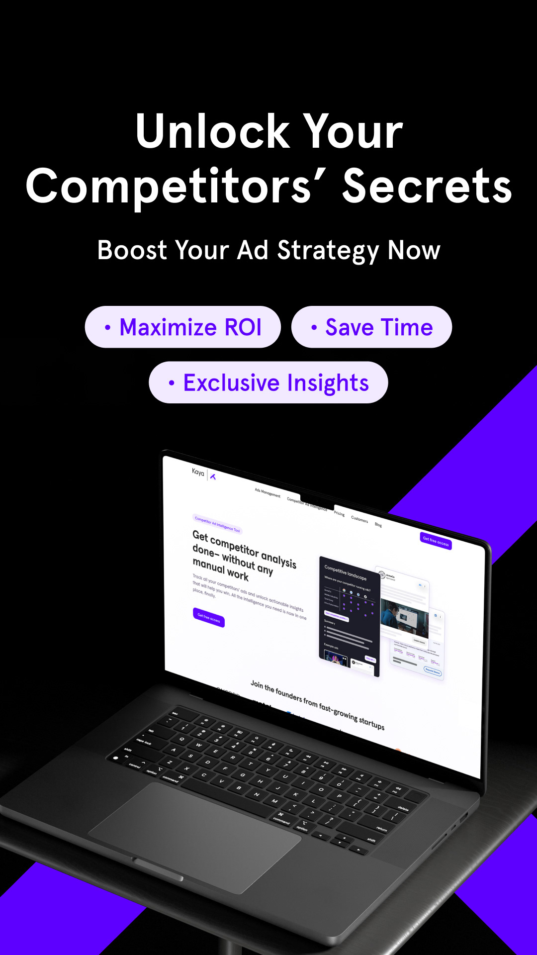
Design a campaign to promote a service focused on helping businesses unlock their competitors' secrets. The campaign highlights three key features:
Design a campaign to promote a service focused on helping businesses unlock their competitors' secrets. The campaign highlights three key features:
Maximise ROI, Save Time, Exclusive Insights
The goal was to craft compelling campaign assets, including hooks, subheadings, CTAs, and key visuals, that resonate with the target audience while effectively communicating the service's value proposition.
Purpose and Goal:
The purpose was to design visually engaging and strategically crafted campaign assets that communicate the service's benefits to potential customers. By emphasizing the three features—maximizing ROI, saving time, and gaining exclusive insights—the campaign aims to position the service as indispensable for businesses seeking a competitive edge.
Design Approach:
The key visuals were designed to complement the campaign's messaging by incorporating elements that evoke a sense of exclusivity, strategy, and success. The visuals utilized clean layouts, professional colour schemes, and iconography that symbolized analysis and growth.
Outcome:
This campaign demonstrates my ability to combine impactful copy with cohesive visual storytelling, creating assets that not only engage but also drive conversions by effectively communicating the service’s unique value proposition.
This campaign demonstrates my ability to combine impactful copy with cohesive visual storytelling, creating assets that not only engage but also drive conversions by effectively communicating the service’s unique value proposition.



Ads & Campaign Design Portfolio: Case Study
Project: Promotional Assets for Theo’s Web3 Platform
Objective:
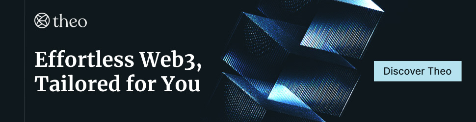
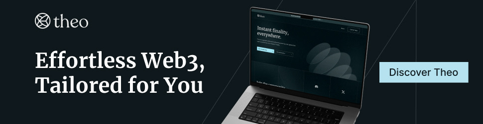
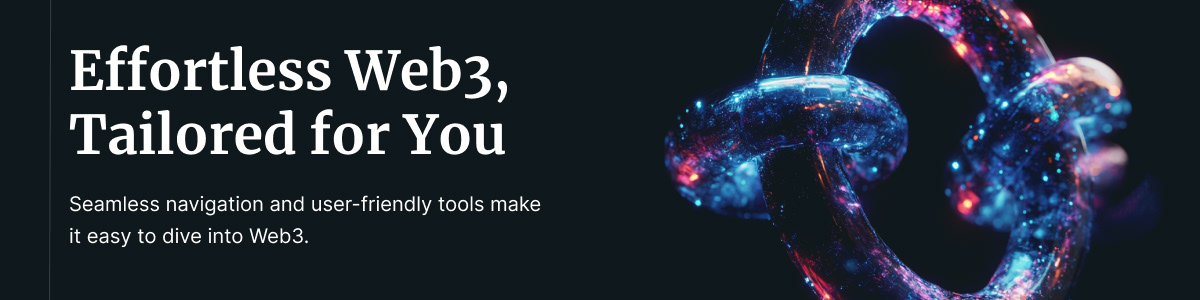
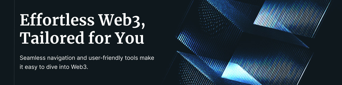
Design a cohesive set of promotional assets to highlight the innovative features of Theo’s Web3 platform, targeting both crypto-natives and newcomers to Web3.
Design a cohesive set of promotional assets to highlight the innovative features of Theo’s Web3 platform, targeting both crypto-natives and newcomers to Web3.
Concept Development:
The campaign concept focused on “Empowering the Future of Web3”, showcasing Theo’s platform as a secure, decentralized, and user-friendly gateway to the Web3 ecosystem. The messaging emphasized accessibility and trust, aligning with Theo’s mission to bridge the gap between complex blockchain technologies and everyday users.
The campaign concept focused on “Empowering the Future of Web3”, showcasing Theo’s platform as a secure, decentralized, and user-friendly gateway to the Web3 ecosystem. The messaging emphasized accessibility and trust, aligning with Theo’s mission to bridge the gap between complex blockchain technologies and everyday users.
Visual Style:
The visual style was inspired by Theo’s branding guidelines, leveraging a futuristic and minimalist aesthetic with a vibrant colour palette. Key design elements included:
Typography: Clean, modern sans-serif fonts to enhance readability.
Graphics: Subtle geometric shapes and gradients to evoke decentralization and innovation.
Color Palette: Theo’s signature hues of blue and purple, symbolizing trust and progress.
Reflection:
Maintaining brand consistency across different formats required careful adherence to Theo’s visual identity guidelines. The challenge was balancing a futuristic aesthetic with accessibility to appeal to both tech-savvy users and Web3 beginners. By iterating on the layout and graphic elements, I ensured that the designs communicated trust and innovation while remaining visually cohesive. The result is a versatile and impactful campaign that aligns with Theo’s goals and engages its target audience effectively.
Website Banner Ad

EMAIL Designs
Social Media Post



Other social ads